Our appetite for reporting is insatiable. Every time finance professionals turn around there is some new disclosure required. Non-finance folks often do not appreciate how much work each new request entails. After all - designing the report and obtaining the right data is often a great deal of work and there is no magic shortcut (once the design is done however there are tools that can dramatically accelerate the generation of the reports).
When designing some reports, we are constrained by a financial reporting standard (PSAB, GAAP, GASB, IFRS etc.). These standards are very prescriptive; they guide professionals about what data must be presented and how it is to be presented.
What about those other reports you prepare and present that may not have such absolute standards to guide you?
Reports like the budget book, management discussion & analysis (MD&A), and quarterly variance reports are often complex documents full of images, graphs, tables and narrative that must combine to tell a comprehensive story to the reader. Where do you get direction on what these reports should look like and what they should include?
Very often the What is based on broad guidance from an authority (GFOA perhaps), past experience, custom, what your competitor/neighbor has done and your understanding of reader preference. Significant weight is often given to recreating the same information which appeared in past iterations, especially when presenting to board/council that are not finance experts. Our experience tells us your recipe starts with "that's what we have always done", and is updated based on the questions your receive from council or board of directors.
And the How? The answer is the same as for the "What", supplemented by the Communication department. In many organizations, there is a Communications department that specifies fonts and spacing guidelines and such.
Despite these "guides", there are still a lot of questions left to the finance professional to answer:
- Should you use tables, graphs or prose to communicate a particular point?
- Is a pie, bar, line, column, area, scatter, bubble, doughnut or radar chart/graph best in this situation?
- What
colours should we use in our charts/graphs? - Should we put labels
in the chart/graph, below in a legend, or both?
Finance & budget professionals who are given the responsibility of making these decisions may not be well-trained in the How, and their choices will affect how the data is read and understood.
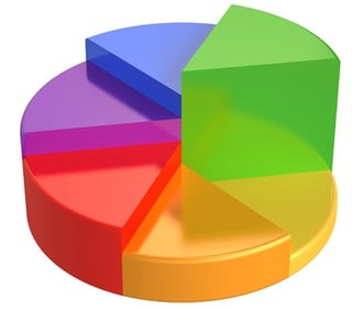
Consider the graph below:

Is the reader now likely to better understand your data as a result of this graph? Unequivocally, "NO" is the answer.
These decisions are far too important to leave to the flip of the coin or a personal sense of style, especially if you are presenting financial data to non-finance experts.
In this series, we will provide finance & budget officers with best practices they should employ when presenting financial data. We will explore many of the Do's and Do Not's and will endeavor to show examples (good and bad) to illustrate the point. For example, not sure why we say the graph above is horrible? Continue reading this series and you will learn this and much more!
To make sure you do not miss any of our Style & Substance posts, be sure to sign up for our blog today.
© 2025 FH Black Inc. All rights reserved. Content may not be reproduced, excerpted, distributed, or transmitted without prior written consent.


